Design System
Genuine Parts Company
One of the most fun and complex projects that I have worked on is a corporate design system. Design systems improve consistency across platforms, build more-intuitive products, and allow designers to focus on addressing bigger problems. This design system will be used across many different external and internal applications. I lead the creation of the Genuine Parts Company Design System at GPC in order to enhance our product design process, workflow, and to ensure consistency across GPC.
Moving from
Sketch to Figma
Moving from Sketch to Figma can be challenging initially. However, Figma's real-time collaboration, design sharing, and commenting features make it easy for designers, developers, stakeholders, and project managers to work seamlessly together. This enhances communication and speeds up the product release process
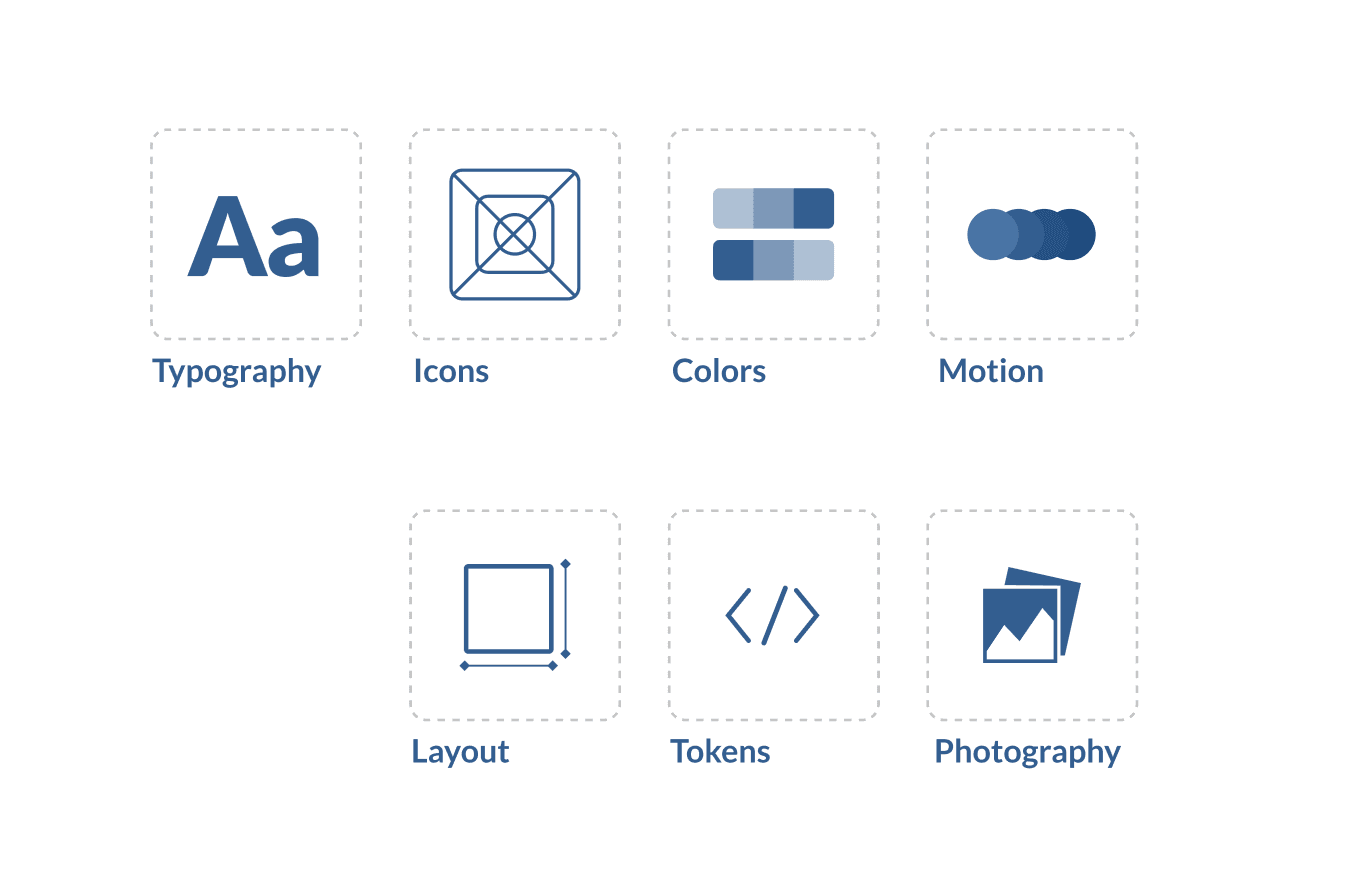
Atomic Design System
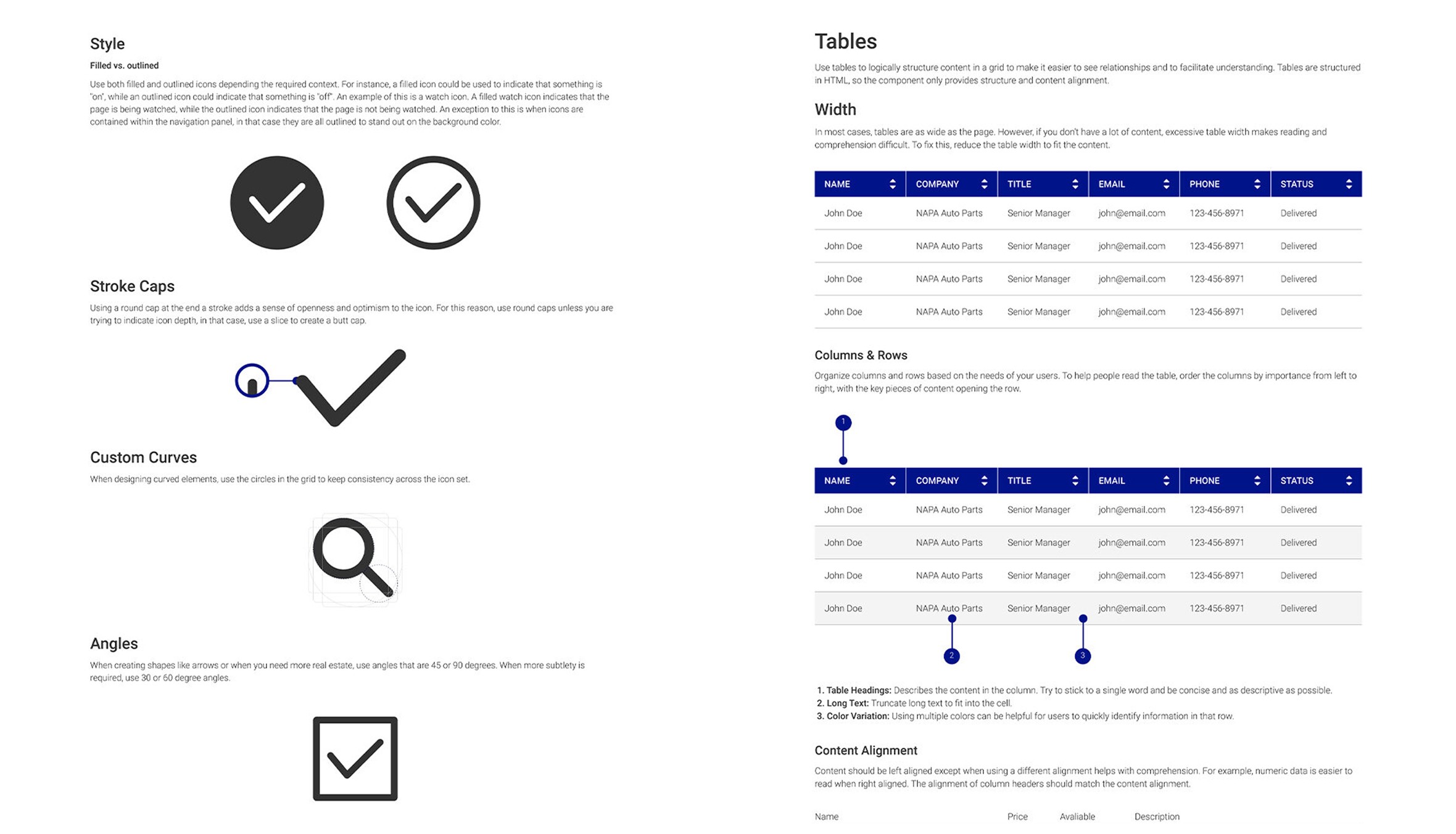
Followed the Atomic design methodology for creating our design system, which allowed us to build scalable and cohesive user interfaces. By breaking down the UI into fundamental components like atoms, molecules, organisms, templates, and pages, we were able to maintain consistency and reusability across the product.
Project : Genuine Parts Company
Design system was created for existing service and needs to
be standardized service UI elements for growing and append features
To create and implement a design language with reusable components to work cohesive and efficiently across GPC Enterprise. This project started back in 2020 when design systems became a popular topic among the design community. That being said, we had to work diligently on an executive proposal in order to get buy in from the business. From there we conducted customer research, UI best practices, UX best practices, and reduce the time spent reinventing the wheel on design solutions. This project has evolved so much over the years and continues to grow.
The Challenge
Getting full support from the business as it’s easy to question the “why” of design system thinking. For starters, brand identity is key especially for a Fortune 200 company recognized across the globe. Prior to the design system, multiple digital channels had their own look and feel. Essentially, we had to create a design system library from the ground up.
Business Goals
To unify our products, increased production rate, improve information architecture, usability, and reduce product complexity.
Getting to know Products &
understanding the context
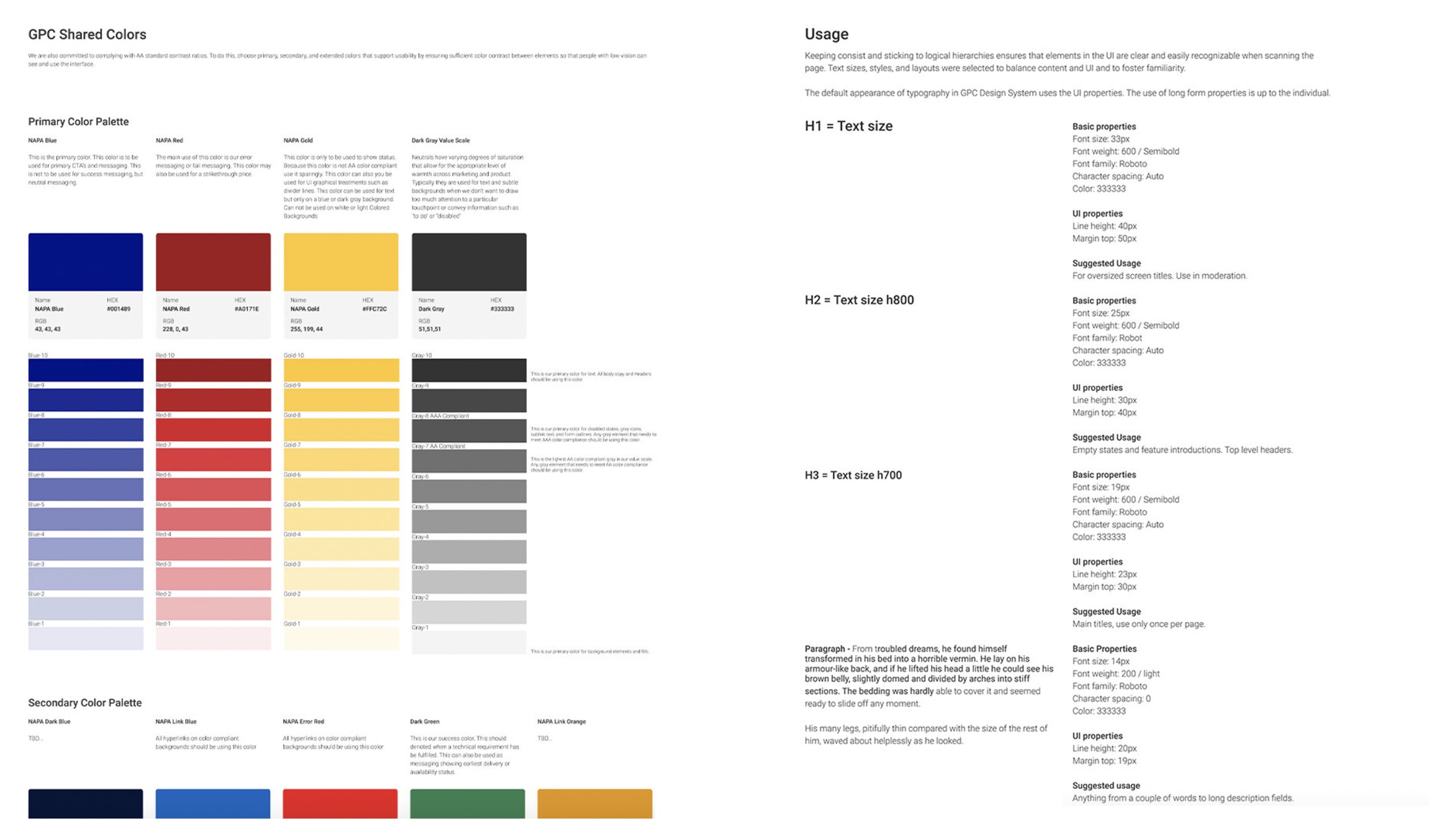
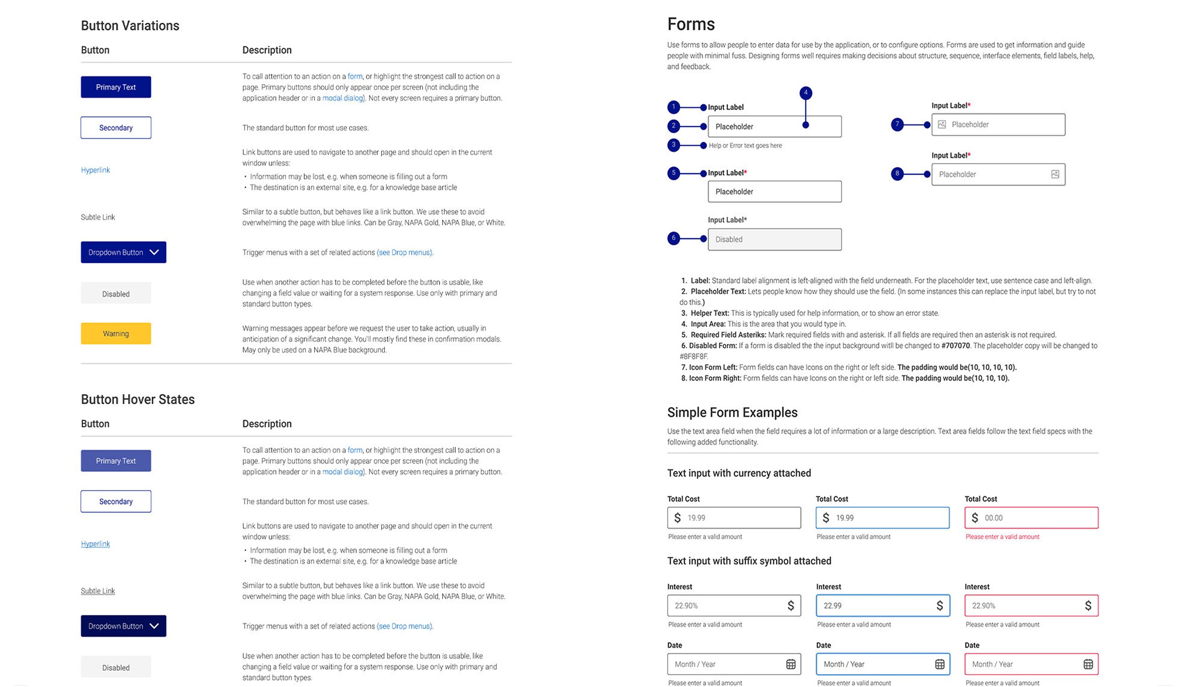
Typography and color are the backbone to great UI design. We made high-impact choices on font and color, with keeping ADA Compliance in mind.
Design, Iterate, and Evolution
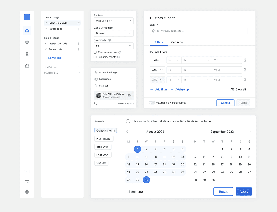
Once we had a fluent design language we designed modular UI components that worked a holistic system. This was a collaborative, laborious, and often fun part of the process. As you will see below, some of the components and early thinking have been updated and expanded upon.
Figma Implementation
One of the advantages of transitioning from Sketch to Figma is the ability to retain all your previous designs seamlessly. Using Figma’s import feature, we can bring in individual Sketch files into your Figma workspace while preserving layer structures and converting symbols into reusable components.
As part of the redesign process, we didn’t just import—we also refined and optimized every component. This included making necessary tweaks, fixing inconsistencies, and ensuring all elements aligned with the new design system for a cleaner, more cohesive experience
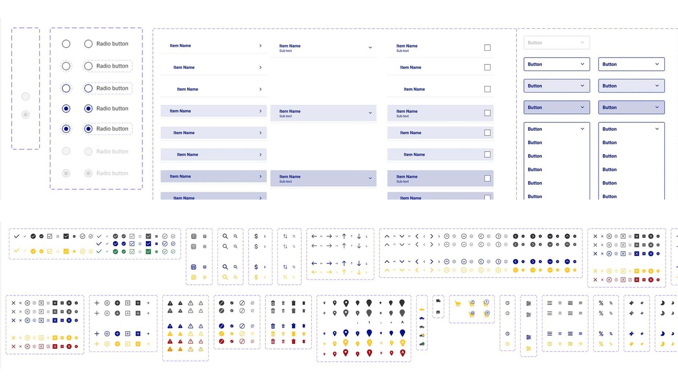
Screenshots show how the early groundwork and foundation started. Please note I can’t take credit for each Figma component and variant made.
However, with the early rules and documentation created in 2022, multiple designers used what we started as a reference. No worries though, I still have all of the knowledge and know how to create components, variants, and utilize auto layout!