Stripe is widely trusted for payments, yet user feedback and UX audits reveal friction during the final payment moment. where even small uncertainty can cause abandonment. This case study focuses on identifying and addressing Stripe checkout UX issues.
While purchasing a subscription on the Framer app, I personally encountered moments of uncertainty during the payment step, particularly around confirmation, processing feedback, and what would happen after tapping the final pay action.
Getting to know the users
& understandingathe context
Problem Statement
Despite Stripe’s technically robust payment infrastructure, users often experience anxiety and confusion during checkout due to:
Unclear confirmation of being on the final step
Ambiguous processing states during payment authorization
Sudden authentication flows without explanation
These issues result in:
Checkout abandonment
Duplicate payment attempts
Increased support requests and loss of trust
Research & Evidence
Sources
Public user feedback (Trustpilot, Reddit, SaaS forums)
Developer discussions around Stripe Checkout
Key Findings
Users do not expect a progress bar during payment
Users do expect clarity, reassurance, and predictability
Generic spinners increase anxiety
Clear copy and feedback reduce hesitation more than visual complexity
Accessibility Considerations
Screen reader announcements for processing states
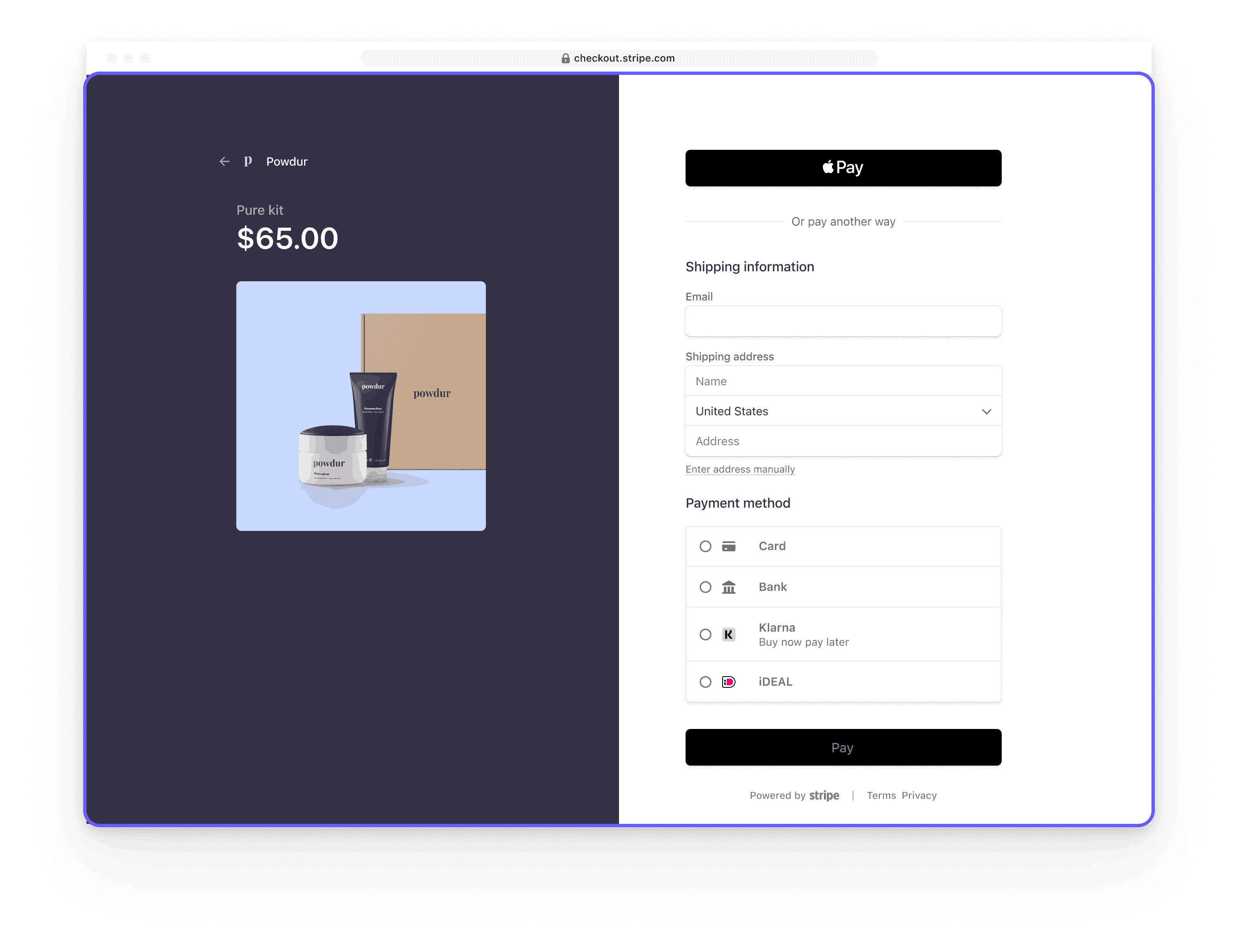
Competitors focus on clarity, not complexity
Competitor payment flows prioritize clarity through clear confirmation cues, explicit system feedback, and minimal friction, helping users understand exactly what’s happening without adding unnecessary steps.
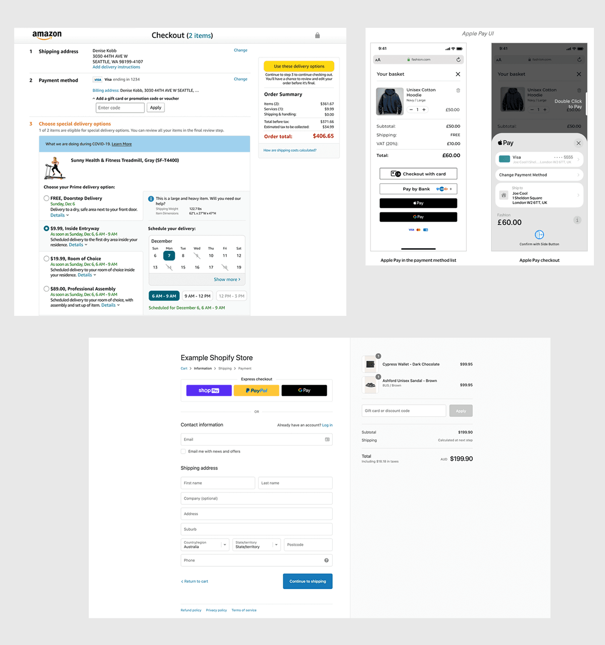
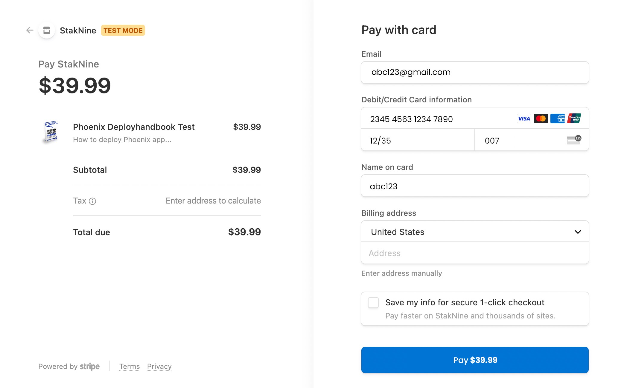
Mobile checkout highlights where uncertainty increases
As users scroll through the payment screen, critical information such as final confirmation, Total Pay amount processing feedback, and next steps are not always visible at once—making it harder to understand what happens after tapping “Pay.”
Design Suggestions &
prototyping
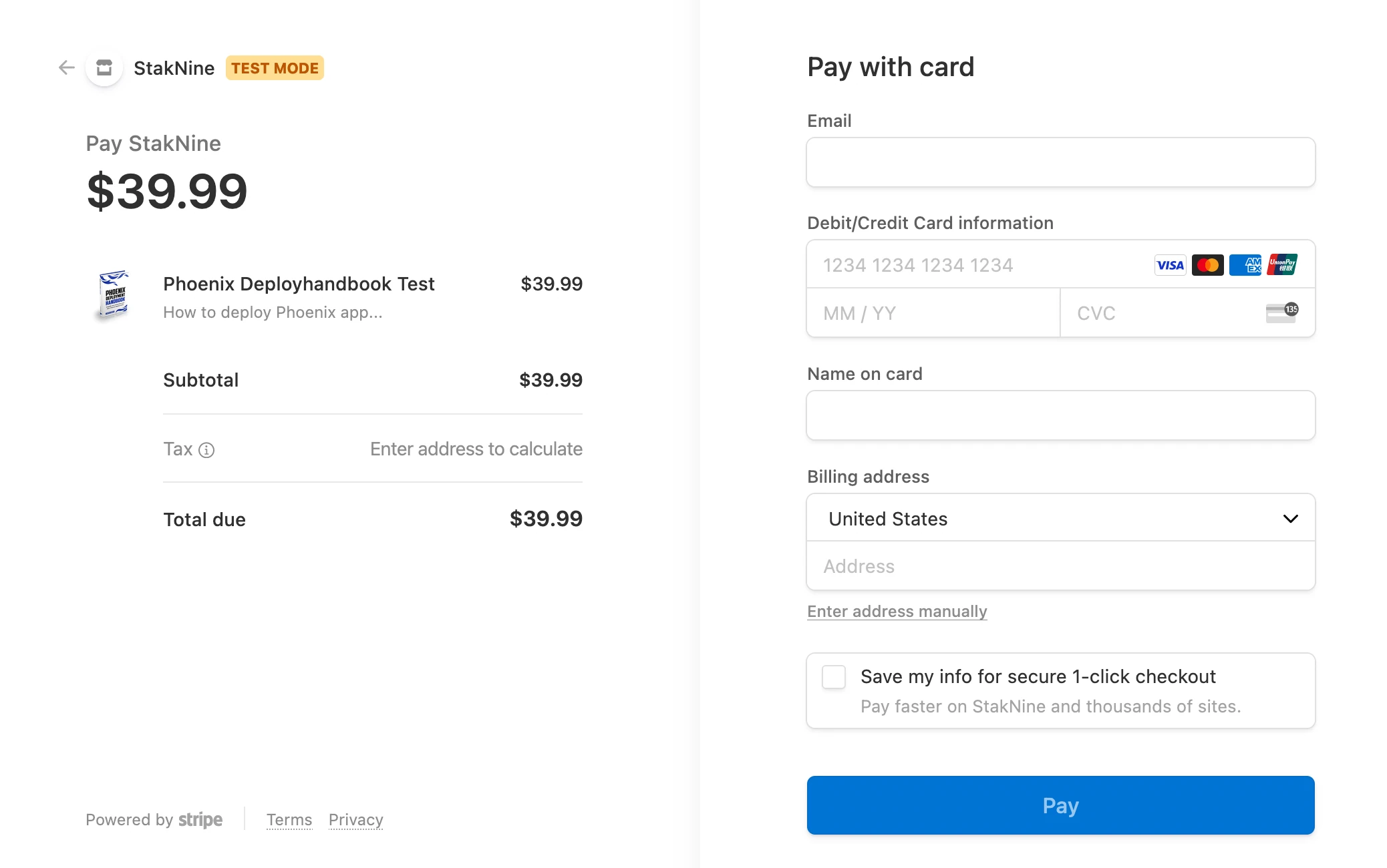
Users often feel uncertain during checkout because the interface doesn’t clearly communicate whether they are on the final step or what will happen after they click “Pay.” Ambiguous titles and CTA labels can cause hesitation, mistakes, or abandonment, especially in high-stakes payment flows
The CTA language is made explicit and outcome-focused. Instead of using “Pay now,” which is vague, the CTA becomes “Confirm and Pay $42.00” or “Pay $42.00 securely”. This communicates both the action and the result, reinforcing trust and clarity. Users know exactly what will happen when they tap the button.
Why It Works
Users immediately understand where they are in the flow.
Reduces anxiety about additional steps or hidden costs.
Improves perceived trust and reliability without cluttering the interface.
Supports faster decision-making and reduces potential abandonment.
Example in Practice
Stripe-powered checkout: Page title updated to “Secure Payment – Final Step”
CTA changed from generic “Pay now” to “Confirm and Pay $42.00”
Order summary and pricing placed adjacent to CTA, visible at a glance
Business Impact
Even small changes like improving titles, CTA labels, and order summary placement can have a significant business impact. By reducing user hesitation and uncertainty, businesses can increase checkout completion rates, reduce failed or duplicate transactions, and improve customer trust. Over time, this leads to higher revenue, fewer support requests, and stronger brand credibility, especially in subscription- or transaction-heavy products.